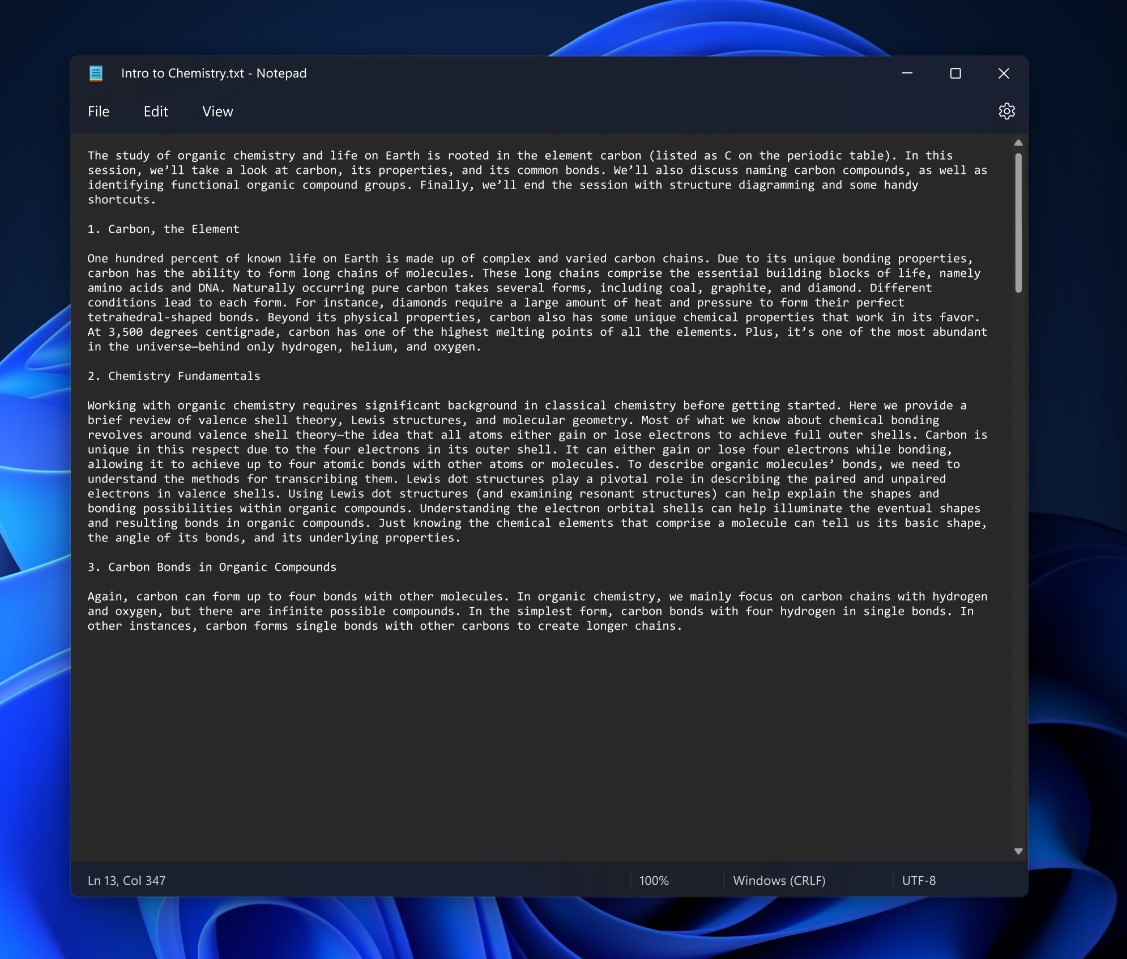
Most note-ably, it finally, at long last, includes a dark mode. That means you won’t have to sear your eyeballs when you’re writing something up in the middle of the night, or it might just fit your stealthy aesthetic better. Notepad will adapt to your system theme by default, but you can also edit the app’s look in the new settings menu located in the upper right corner, which is also where you can now select your preferred font.
The overall aesthetic is refined too, with translucent elements — or ‘Mica,’ as Mica-rosoft calls it (sorry) — at the top and bottom of the app. Lastly, Microsoft has redesigned the find and replace experience to be more in line with modern applications, and the company has added multi-level undo to give users a bit more control over their edits. The fact that this redesign is launching now once again shows that Windows 11 was released as an unfinished OS, but hey, better late than never. That said, you’ll probably have to wait a while to see this new design if you’re not a Windows Insider. Microsoft has decided to give big updates to Windows 11 once a year rather than twice a year as it did with Windows 10. It’s possible the company might push out this update separately, but chances are you’ll have to stick to the old Notepad for at least a while longer. Microsoft also warns that there are a few known issues with this preview — check the source link below — but them’s the breaks for signing up to be beta tester.
